The ‘Long S’

In my many tumbles down the research rabbit hole, I have ended up in a number of manuscripts published in the 1700s and 1800s with which I have a love-hate relationship. No small part of the hate in that love-hate relationship rests squarely upon the vexing character known as the ‘long s’.

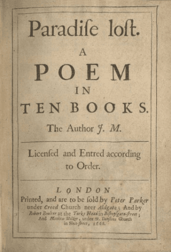
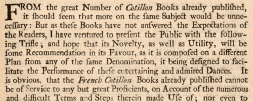
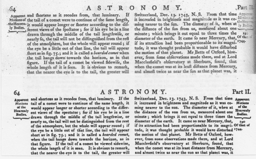
You might have seen it, sitting in the middle of a word, making it look misspelled or as though it was written with a lisp. “Congress” looks like “Congrefs”. “Lost” looks like “Loft”. Utterly crazy-making as I stumble through the manuscript, tripping on every occurrence.
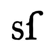
Technically the lower case ‘f’ and the ‘long s’ are different characters. The ‘f’ has a cross bar though the middle of the long stroke. The ‘long s’ either as no cross bar or only a half a cross bar on the left side of the stroke, like this: ſ. I don’t know about you, but my brain still sees that as an ‘f’ even when I know it isn’t and I literally feel like I stumble every time I see it.
Needless to say, I had to ask why was it used and why is it not any more. Here’s what I learned.
In Print

During the 1700s and very early 1800s, the rules for typography and handwriting were different with respect to the use of the ‘long s’.
This was the list of rules I was able to find.
• short s is used at the end of a word (e.g. ſucceſs)
• short s is used before an apostrophe
• short s is used before the letter f (e.g. ſatisfaction, ſucceſsful)
• short s is used after the letter f (e.g. offset), although not if the word is hyphenated (e.g. off-ſet)
• short s is used before the letter b in books published during the 17th century and the first half of the 18th century (e.g. husband, Shaftsbury), but long s is used in books published during the second half of the 18th century (e.g. huſband, Shaftſbury)
• short s is used before the letter k in books published during the 17th century and the first half of the 18th century (e.g. skin, ask), but long s is used in books published during the second half of the 18th century (e.g. ſkin, aſk)
• Compound words with the first element ending in double s and the second element beginning with s are normally and correctly written with a dividing hyphen (e.g. Croſs-ſtitch, Croſs-ſtaff), but very occasionally may be written as a single word, in which case the middle letter s is written short (e.g. Croſsſtitch, croſsſtaff).
• long s is used initially and medially except for the exceptions noted above (e.g. ſong, uſe, preſs, ſubſtitute)
• long s is used before a hyphen at a line break (e.g. neceſ-ſary, pleaſ-ed), even when it would normally be a short s (e.g. Shaftſ-bury and huſ-band in a book where Shaftsbury and husband are normal), although exceptions do occur (e.g. Mans-field)
• double s is normally written as double long s medially and as long s followed by short s finally (e.g. poſſeſs, poſſeſſion), although in some late 18th and early 19th century books a different rule is applied, reflecting contemporary usage in handwriting, in which long s is used exclusively before short s medially
• short s is used before a hyphen in compound words with the first element ending in the letter s (e.g. croſs-piece, croſs-examination, Preſs-work, bird’s-neſt)
• long s is maintained in abbreviations such as ſ. for ſubſtantive, and Geneſ. for Geneſis (this rule means that it is practically impossible to implement fully correct automatic contextual substitution of long s at the font level)
Bell, 2013
In Handwriting

Handwriting from the same period follows a much simplified set of rules.
The Complete Letter-writer of 1778 offers a single, vague and simple rule: The long s must never be inserted immediately after the short s, nor at the end of a word.
In practice, we most often see that the ‘long s’ usually only appears as the first letter of double s at any point in a word. This would leave Mississippi looking like: “Miſsiſsippi”.
Though I do not have anything scholarly to back this up, my hunch is that people could simply not remember or be bothered with the extensive rules in their day to day writing and the only one which really stuck (or made sense) was the double s rule.
Decline of the ‘Long S’

The ‘long s’ fell out of favor by the lat 1700s. Publishers in France and England began omitting the ‘ſ’ from their typefaces, with the reasoning that ‘f’ and ‘ſ’ were easy to confuse and cluttered ‘ſ’ up the look of the print lines. I don’t really disagree with them.
The use of the ‘long s’ persised in in print the United States for somewhat longer, but by mid 1800’s, the character had largely fallen out of use in typography. The character persisted in handwriting for a while longer, but by the end of the 1800’s had largely vanished.
The one place you can still find ‘ſ’ is as an abbreviatioin of the British English shilling prior to decimilization. (often though a slash (/) character was used to stand in for the ‘long s’.)
References
Bell, JL. The Long List of Rule for the Long S. Boston 1775, OCTOBER 10, 2013. Accessed July 15, 2022. https://boston1775.blogspot.com/2013/10/the-long-list-of-rules-for-long-s.html
Gannon, Megan. “Why does the latter ‘s’ look like an ‘f’ in old manuscripts?” Live Science. May 20, 2019. Accessed July 25, 2022. https://www.livescience.com/65560-long-s-old-texts.html
Hurst, Thomas. The Cotilions, made plain and easy. London: Thornley and Sutton, 1769.
Lady Smatter. “Rules for Writing Long and Short S in Jane Austen’s Era.” Her Reputation for Accomplishment. April, 200, 2015. Accessed July 30,2022. https://herreputationforaccomplishment.wordpress.com/2015/04/22/rules-for-writing-long-and-short-s-in-jane-austens-era/
The Complete Letter-writer. Edinburgh: W. Darling. 1778.

Oh, my gosh. I have a headache just trying to read it in those pictures. Let alone trying to write with it or remember all the rules. Thanks for sharing with us. I’ve always wondered about it when I saw it in early documents. I didn’t dare attempt the rabbit hole I knew it would drag me into. You are brave. Blessings.
Pingback:Best Random Bits of 2022 - Random Bits of Fascination